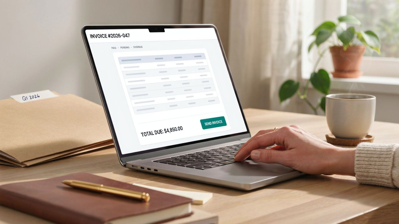
A logo for invoice does quiet branding work at a moment you know the client is paying attention. Unlike an ad they can scroll past, an invoice always gets opened. Here is why that matters, and the file specs that stop your logo printing blurry.
TL;DR
- A logo on your invoice is brand recognition at the point of payment, which is one of the few documents a client reliably reads end to end.
- Use 300 DPI for anything printed, and 150 DPI for screen. Screenshots are 72 DPI and will look fuzzy.
- PNG for logos needing a transparent background, JPG for solid full-bleed logos, vector (SVG, EPS, PDF) as your master file.
- Never scale a small logo up. Export from the original at the size you need, or it pixelates.
- Around 280 x 200 pixels is a common target for invoice platforms, with the aspect ratio locked.
Why use a logo for invoice branding at all?

- It builds recognition. Clients want to know who they are dealing with, especially in B2B. A logo for invoice branding tells them at a glance whose bill this is, before they read a word.
- It ties your paperwork to everything else. You already push marketing collateral through ads, newsletters, and cards. The same mark on the invoice links the paperwork back to the brand.
- It sets you apart from firms that skip it. Your client almost certainly buys from someone else too. From the first email to the last bill, your business logo is what keeps you in mind.
- It looks professional. Nearly every large firm brands its invoices. An unbranded one looks like a template someone filled in five minutes ago, which is often just what happened.
Getting the File Right for Your Logo for Invoice
Almost no guide covers this part, and it is where most invoice logos fail.
- Resolution. Use 300 DPI for anything printed, at the final size. For screen-only PDFs, 150 DPI is enough. A screenshot of your own logo is 72 DPI and will print fuzzy. Always work from the original file, not something pulled off your website.
- Format. PNG if your logo needs a clear background, which most do. JPG works for a solid block logo with no transparency. Keep a vector master file in SVG, EPS, or PDF. Vectors scale to any size without going soft.
- Dimensions. Many invoicing platforms suggest somewhere near 280 x 200 pixels. Lock the aspect ratio when you resize, or the logo squashes.
- Never upscale. Export from the original at the biggest size you will ever need, then scale down. Go the other way and you get the blur you see on so many small business invoices.
- Check it in print. Send yourself a test invoice and print it. Colors shift between screen and paper. A logo that looks crisp on a monitor can lose fine detail on a page.
Designing a Logo for Invoice Worth Displaying
No logo yet? These are the principles that matter most for a mark headed onto paperwork.
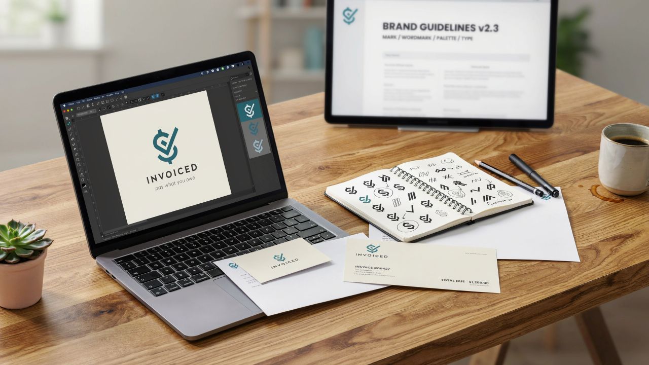
- Keep it unique. Look at rivals to learn the visual language of your trade, then design something that is not a copy of theirs.
- Pick colors with care. Bad color pairings are the top reason a logo fails to land. Choose a palette that fits the business, not one that just looks nice.
- Keep it simple. Apple, Amazon, Starbucks, FedEx. None of them are busy. Simple marks survive being shrunk to invoice size, which is just what yours must do.
- Customize the type. If your business name sits in the mark, a distinct typeface does a lot of the work.
- Research who you sell to. Your logo design should suit the region, trade, and taste of your buyers, not your own.
- Match your brand. A playful logo on a law firm sends the wrong signal. The mark should agree with what the business is.
- Read a little first. If design is new ground, plenty of sources cover what makes a innovative, and trustworthy logo.
- Hire out if you need to. A pro will give you several concepts and, more usefully, the full file set in every format you need later.
Where a Logo for Invoice Fits in Your Business Paperwork
An invoice is not the only document worth branding. The same logo belongs on quotes, statements, and receipts, so a client sees one mark across the whole deal.
Know the difference before you brand them. An invoice asks for payment. A receipt confirms it arrived. If you are unsure which to send, the full invoice vs receipt comparison covers it.
On the invoice side, a smoother invoicing process usually means software that stores your logo once and adds it for you.
Adding your logo with Receiptmakerly
One scope note first. Receiptmakerly makes receipts, not invoices. For invoices you will want a payment processor or dedicated invoicing software.
For the receipt half of your paperwork, it lets you upload your logo and drop it onto a template. That covers everything from an itemized receipt to the wider set of business receipts a firm issues day to day.
One caveat. Not every template has a logo slot. Pick one that does before you build the receipt, rather than filling in every field and then finding the logo has nowhere to sit.
Frequently asked questions
What size should a logo be on an invoice?
Around 280 x 200 pixels suits most invoicing platforms. Resolution and aspect ratio matter more. Use 300 DPI for print, and lock the ratio when you resize so the mark does not stretch.
What file format works best for an invoice logo?
PNG for anything needing a clear background, which covers most logos. JPG is fine for a solid block mark. Keep a vector master in SVG, EPS, or PDF so you can export any size later without losing quality.
Why does my logo look blurry on printed invoices?
Almost always resolution. A logo grabbed from a website or a screenshot is 72 DPI. That looks fine on screen and poor on paper. Go back to the original file and export at 300 DPI.
Do I legally need a logo on an invoice?
No. A logo is a branding choice, not a legal must. What an invoice does need is your business details, an invoice number, a breakdown of charges, the amount due, and the payment terms.
Should the same logo go on receipts as well as invoices?
Yes. One mark across quotes, invoices, and receipts is what makes the branding work. A client should know the document is yours at any stage.
Final thoughts
A logo for invoice is small, cheap branding on a document you have to send anyway. The design side is the easy part, and most firms get it roughly right.
The file itself is what trips people up. Get the resolution and format right once, keep the original where you can find it, and the logo stays sharp on every invoice you send.
Use Receiptmakerly to create polished, export-ready receipts in minutes.